Using: For this tutorial I am using Netbean IDE , windows xp plateform, php as server side language.
Pre-req: You should know about html, java script and css.
Preview my work here
I was looking into twitter bootstrap so here is my findings.
A) Structure of application:
All you need is download , extract and and put the folders into your application. It has js, css and img folders. you can use it with any server side language. For demonstration I am using php. So after putting the files my project lookes like below:

B) Structure of web page:
For creating a web page, we have 2 options
1) Use Table structure/layout to display your contents.
2) Use Divs to show contents , then you need to concentrate on css to set thes div on required positions,
Twitter Bootstrap solves layout issues. They provide css of div to divid your pages into rows and columns. So we dont need to worry about positions of the Divs to show our contents.
Responsive Bootstrap: They have css/style created for tabs, mobiles and desktop. So your structure can easily adjust for device and desktop. All you need is to include a meta tag and css file
Their recommendation: Use on a limited basis and avoid creating entirely different versions of the same site. Instead, use them to complement each device's presentation. Responsive utilities should not be used with tables, and as such are not supported. (Reference)
So I made a sample page with rows and colums on desktopn this lookes like

On mobile phone it lookes like below:


C) Widgets
We have list of wigets below. These can are adjustable on both devices and destops. So that means you can use intratcive and cool wedgits on your mobile applications.
So here is a view on desktop
 and how the look on mobile device


D) Javascript
Here we have
E) Style
There are amazing style sheets available that workes for mobiles, tabs and destop. You can create beautiful headings, labels, buttons, meues , carosels, thumnails etc. It provides redability on mobile devices.
Reference
F) Customization
We can easily customize our applications. And with it we can create application for both mobile and dektops. It will definitly decrease the development cost. Because I have noticed that web developer spent most of the time in adjectment of contents position on page and we put extra efforts to make our web pages compatible with mobile browsers. In twitter bootsrap javascript is very usefull, provides all kind of event handling that we need in a web application.

Pre-req: You should know about html, java script and css.
Preview my work here
I was looking into twitter bootstrap so here is my findings.
A) Structure of application:
All you need is download , extract and and put the folders into your application. It has js, css and img folders. you can use it with any server side language. For demonstration I am using php. So after putting the files my project lookes like below:

B) Structure of web page:
For creating a web page, we have 2 options
1) Use Table structure/layout to display your contents.
2) Use Divs to show contents , then you need to concentrate on css to set thes div on required positions,
Twitter Bootstrap solves layout issues. They provide css of div to divid your pages into rows and columns. So we dont need to worry about positions of the Divs to show our contents.
<div class="row">Column span levels are from 1 to 12.
<div class="span1">contents 1</div>
<div class="span1">contents 2</div>
</div>
Responsive Bootstrap: They have css/style created for tabs, mobiles and desktop. So your structure can easily adjust for device and desktop. All you need is to include a meta tag and css file
- <meta name="viewport" content="width=device-width, initial-scale=1.0">
- <link href="assets/css/bootstrap-responsive.css" rel="stylesheet">
Their recommendation: Use on a limited basis and avoid creating entirely different versions of the same site. Instead, use them to complement each device's presentation. Responsive utilities should not be used with tables, and as such are not supported. (Reference)
So I made a sample page with rows and colums on desktopn this lookes like
On mobile phone it lookes like below:


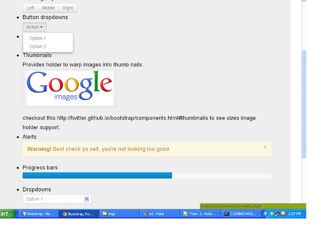
C) Widgets
We have list of wigets below. These can are adjustable on both devices and destops. So that means you can use intratcive and cool wedgits on your mobile applications.
- Button groups
- Button dropdowns
- Navigational tabs, pills, and lists
- Navbar
- Labels
- Badges
- Page headers and hero unit
- Thumbnails
- Alerts
- Progress bars
- Modals
- Dropdowns
- Tooltips
- Popovers
- Accordion
- Carousel
- Typeahead
So here is a view on desktop


D) Javascript
Here we have
- Event handling (like we do in web app i.e clicks, selections, display, inrection etc
- Transitions
- Custom popup called Modals
- Tooltips
- Carousel
E) Style
There are amazing style sheets available that workes for mobiles, tabs and destop. You can create beautiful headings, labels, buttons, meues , carosels, thumnails etc. It provides redability on mobile devices.
Reference
F) Customization
We can easily customize our applications. And with it we can create application for both mobile and dektops. It will definitly decrease the development cost. Because I have noticed that web developer spent most of the time in adjectment of contents position on page and we put extra efforts to make our web pages compatible with mobile browsers. In twitter bootsrap javascript is very usefull, provides all kind of event handling that we need in a web application.

No comments:
Post a Comment